The Renew Skateboard Project
A small organization that takes donated used skateboard parts from the community and rebuilds them in to complete skateboards. These skateboards are then given to youth to alleviate costs to the family of purchasing a high-quality skateboard. The goal is to introduce youth to the incredible world of skateboarding at no cost, while creating a cycle of giving in the skateboard community.

Creating the visual language for Renew was a treat. From the wooden donation crate to the logo and DIY attitude, everything fit in with my ambition. I had the vision for Renew and before I even approached anyone about the idea I made the logo and website. I knew that if I felt confident in the vision of Renew as a brand I would be better situated putting the concept in front of business owners and the skateboarding community.

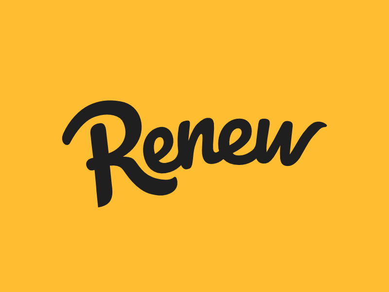
Because the program is for young folks I wanted the logo to have playful energy, something between a child’s writing and graffiti. While picking a font I noticed the negative space in the ‘E’ letters and went from there. What makes this wordmark work so well is how legible and recognizable it is. Simple, strong, high contrast and easy to read.